Argus – AI‑powered SaaS for Medicare Compliance and Clawback Protection
Shoreline Medical Administration is a startup that protects wound care providers from financial loss by reviewing claim‑related clinical records and offering a guarantee against insurance clawbacks resulting from Medicare non‑compliance.
In late 2025, the company was looking to unlock new levels of growth in part by launching a proprietary SaaS platform, Argus, in a move that would help position them to scale sustainably and operate more efficiently. I had the opportunity to help them bring their vision for Argus to life.
Ownership & Impact
I led the end-to-end design of Argus, partnering with Shoreline Medical's engineering, product, and operations teams to translate business constraints and user insight into scalable product architecture. Over six weeks, I ran rapid research, built out the core product architecture and interaction systems, negotiated design priorities within tight constraints, and owned the UI design. My contributions helped position Shoreline for immediate efficiency gains and long-term growth.
A winning business model limited by its tooling
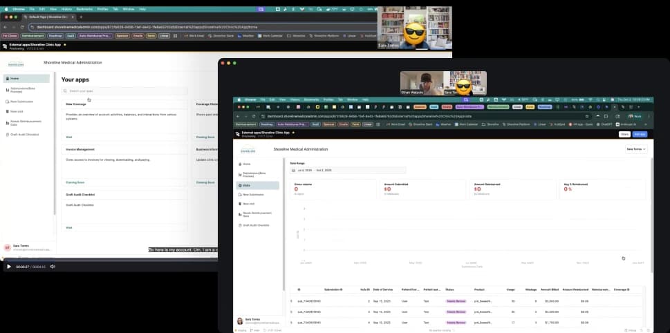
Shoreline was already a profitable Medicare compliance business, earning a percentage on successfully defended reimbursements and handling tens of millions in claims each month. When I joined, their system consisted of two apps built in Retool.
Manually review only complex submissions
Interface for DoS submissions
Failed as effective Communication tool
Confusing and unreliable
By leveraging a fledgling internal AI review service used by the Ops team, Shoreline planned to transform the client-facing component of their system into a SaaS platform where clinicians could run compliance reviews on their own.
From concept to beta in six weeks
The stakes
WISeR—a new CMS regulatory model set to roll out in January 2026—would subject Medicare claims in some states to automated AI scrutiny before approval, likely resulting in a significant rise in denials. Being first-to-market with a tool that mitigated WISeR's strict adjudication would give Shoreline a significant edge.
Design mandate
Transform Shoreline's existing Retool client portal into a multi-tenant, HIPAA-compliant platform that could:
Domain immersion & design priorities
I wasted no time in familiarizing myself with Shoreline's operations, graft procedure Medicare compliance and client workflows. I studied the current Retool implementation, dove into clinical documentation, and hosted structured sessions with Shoreline Reviewers, Compliance & Auditing Specialist, and CTO.
Key findings
Through my conversations with the team I made a few interesting observations about the current ecosystem and the way clients worked with Shoreline.
I was surprised to learn that the sole purpose of the AI review service was to assist the operations team, yet no one actually used it... except for one Reviewer, Benjamin, who typically just scanned the feedback for critical fails as a starting point. The team was bought into the vision of automated review, but no one trusted the AI yet.
The existing Retool apps created friction in the review workflow. Users found it easier to communicate via email, downloading and uploading documents manually rather than using the purpose-built tools.
Contrary to initial assumptions, the people most frequently interacting with the system were office administrators, not clinicians. This discovery significantly influenced the interface design priorities.
Status visibility was a major pain point. Clients frequently reached out to Shoreline staff just to understand the current state of their submissions, creating unnecessary overhead for both parties.
The focus needed to be on improving usability, maximizing trust and helping clients confidently navigate a high-stakes, multi-part, multi-day workflow. I documented design priorities based on my findings to supplement Shoreline's feature wishlist and assist with ideation.
Benchmarking + Goal setting
There were little to no analytics available. We wanted a snapshot of sentiment and quantifiable metrics to demonstrate the project's ROI, so the interview script and a survey were designed to capture that information.
Early exploration & scope refinement
Together with the product team, I mapped out the MVP product requirements and flow, using insights from my conversations with Operations to highlight friction points and guide feature discussions and prioritization.
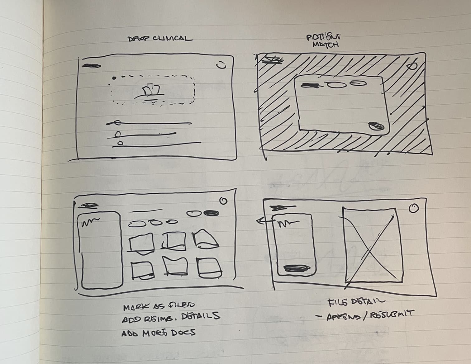
Distinct goal-based workflows began to emerge and the exercise led to collaborative, exploratory end-to-end sketching, where early screen concepts began to take shape.
Key early design concepts locked in
Critical to be explored further
During exploration we identified statuses and feedback as two underlying systems that were driving the core user experience. Optimizing these would be fundamental to creating an MVP that "just worked".
UI foundations
The existing Shoreline brand came across as warm but too dated and underpowered for a high‑trust, AI-powered SaaS UI in 2025. I partnered with the Head of Marketing to create a lightweight extension of the existing guidelines sufficient to support the project while staying visually cohesive with Shoreline.
Color
The primary color was refined to a deeper, more dynamic shade of Shoreline teal that was well within WCAG 2.2 AA standards. System colors were established, including a grayscale and the RAG values we would need for validation and feedback.

We agreed that "Guaranteeing" an Encounter should feel elevated and visually distinct without competing with system CTAs. I explored using Shoreline 'sunshine' yellow to create a gradient which would be reserved for Guarantee-related elements.
Font
Logo
An idea for a logomark came to me during a run one evening. Branding wasn't in scope for the project but I couldn't help but draft a concept! I pitched it to the team the next day and was met with positive feedback.


Developing core workflows
In the early stages of the project we uncovered two underlying paradigms that were driving the core user workflows. Optimizing these would be fundamental to creating an MVP that "just worked".
1. Feedback Interaction Model
I learned in Discovery that feedback from the AI review service wasn't being used because it lacked credibility and was hard to digest. If we expected non‑experts to embrace the AI recommendations, I needed to design a feedback system that was organized, scored, written, and interactive in a way that would solve for these shortcomings.
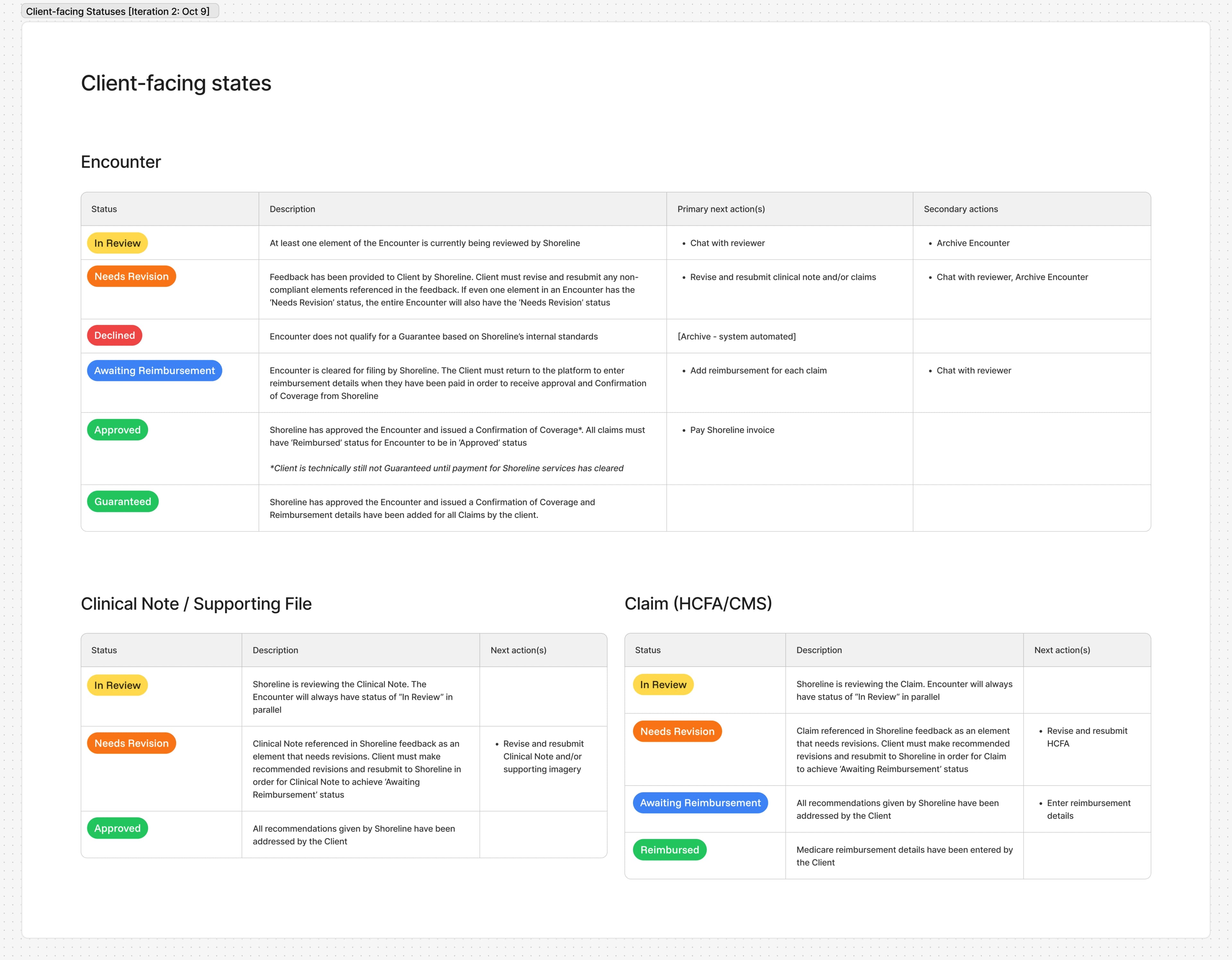
2. Object State Model & Statuses
In the current implementation, Encounter and document statuses were manually managed by Shoreline reviewers. Argus would have no human intermediary, so transitions needed to be automated based on object states. Additionally, user research revealed that Encounter status labels were confusing, leaving users unclear about where things stood or what to do next. I needed to redefine object states to be congruent with the new self‑serve model and map them to clearer, more helpful statuses.
Because these systems were tightly coupled, I decided to work them out pragmatically through rapid, iterative cycles of lo-fi prototyping and review, rather than in isolation. This also gave me the chance to test out some high-level UI decisions on the encounter and file detail pages.
My first attempt at tying everything together missed the mark but did succeed in flushing out finer details, edge cases, and—most importantly—some differing interpretations of operational flow among the cross-functional team.
To align everyone and get the answers I needed to continue, I created a service blueprint as a shared source of truth.
Iterating on the prototype and blueprint in parallel helped close gaps in our understanding of object state architecture and even led operations to adopt a change to their process. Each successive cycle informed documentation and shaped the UI, bringing us closer to an MVP-ready solution.
Object State Model & Statuses
Objects had different lifecycles, states, and relationships to other objects. For this reason, they were allowed to have different statuses. Variances were documented and used to keep complex workflows predictable and extendable.
Design infrastructure handoff
The architecture was set. The brand direction was approved. At this point I had enough to formalize the base theme, a handful of basic components, and the app layout & navigation. Engineering could begin putting a dent in the framework while I pushed on with the platform features.
Construction of key components
Collaboratively documenting the mechanisms that supported core workflows unblocked me from chiseling out the minutiae of some key pieces of the UI. Staying aligned with our design priorities from week one and building off of some of the patterns that emerged during ideation, I started drilling into the details of several key components.

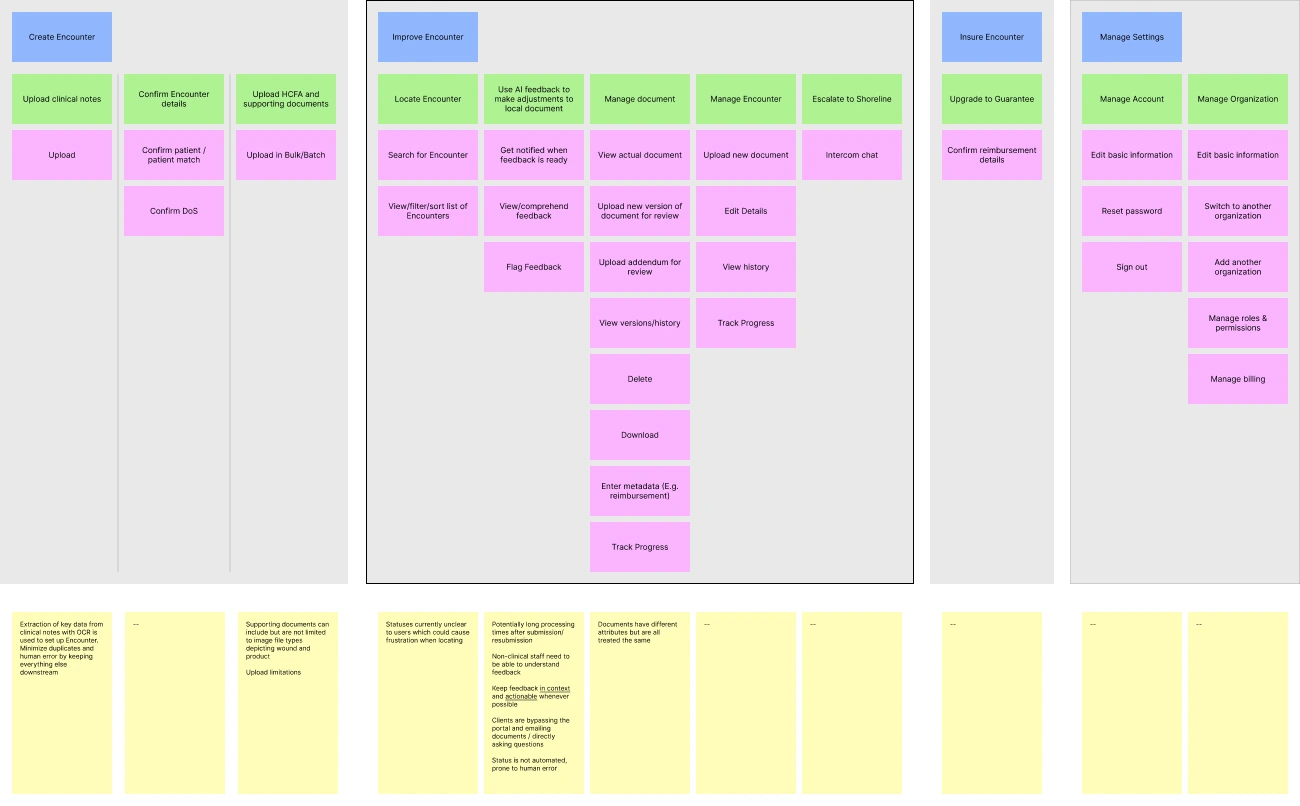
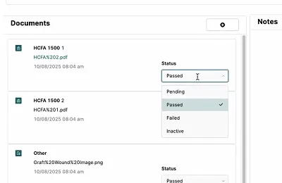
- Encounter sidebar – High-level progress readout and aggregate encounter and file-level feedback. Jump to final design.
- Suggestion cards – Deliver AI feedback. Support multiple issue types, relationships, and actions. Exist across both encounter and file view. Jump to final design.
- File sidebar – Feedback scoped to specific file and access to file details and actions including history and resubmission. Jump to final design.
The pivot
Midway through week three, Shoreline's leadership made a strategic decision to diverge from the original plan. Instead of rushing the full self-service experience we would begin with ‘MVP 0.5’, an improved client portal designed to easily evolve into its final form when the AI model reached an acceptable level of maturity.
The new challenge
So where did that leave me? MVP 0.5 needed to work with the Retool Ops app without necessitating large-scale updates to it, elevate the current client portal experience, and consist of screens and components that were designed to painlessly grow to support the original vision for AI self-service at a later date.
Fortunately, abstracting user goals from features early on paid dividends. The foundation was strong. Statuses still worked. The paths and features that supported the paths to those goals would be different, at first. A full-scale overhaul wasn’t necessary, but some of my screens and components would need to be carefully crafted to embrace the change in MVP 1.0 and beyond.
Final Designs
Encounter creation workflow
The old Retool platform forced clinical staff to upload documents individually (sometimes requiring up to 17 separate uploads for a single patient visit) which directly translated to totally abandoned submissions or requests for assistance. Creating a new submission in Argus was easy and required zero hand-holding.
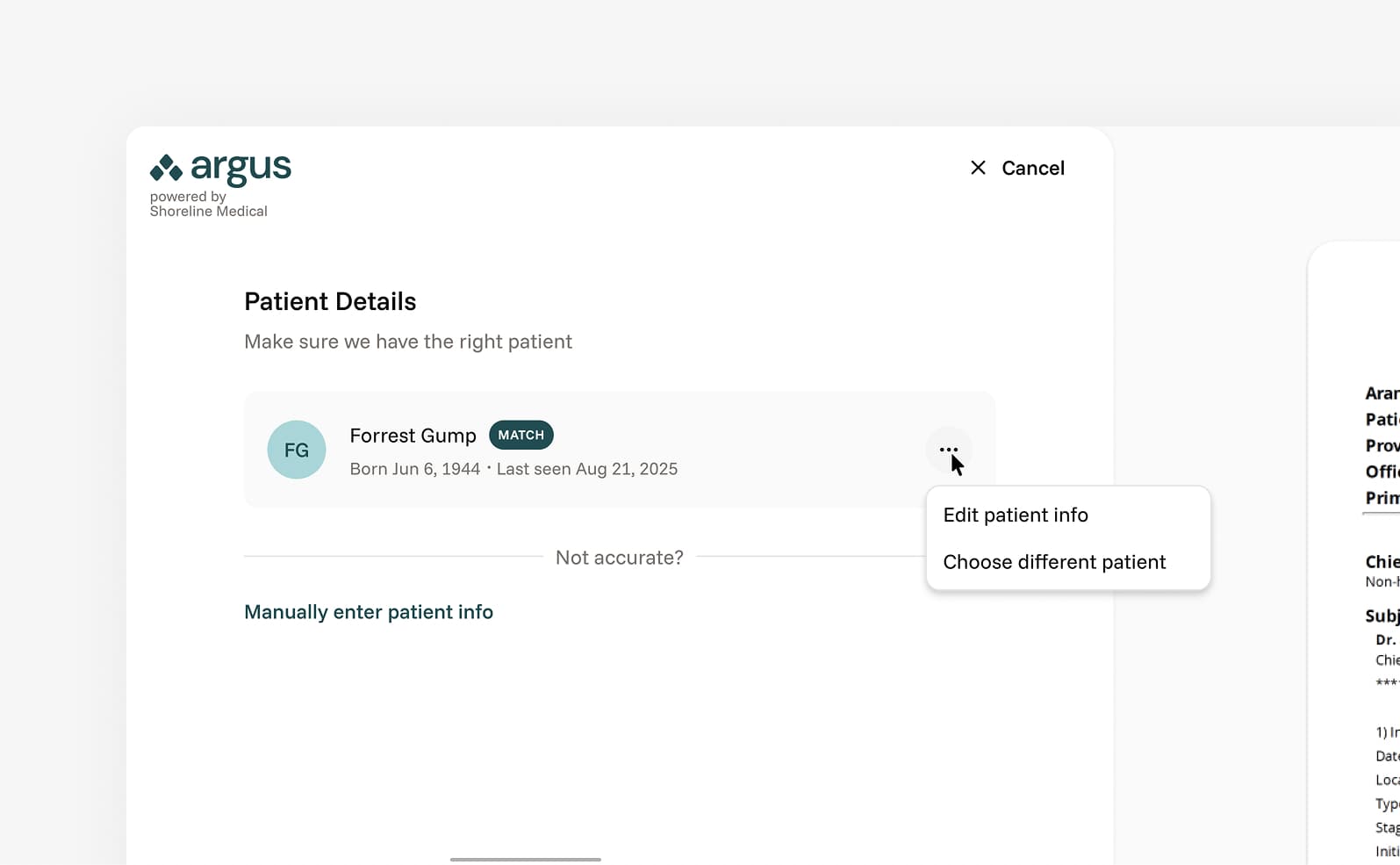
I designed a smart patient-matching feature to address duplicate profiles caused by OCR errors and human typos. I mapped out fuzzy matching logic to identify 'near-duplicates' in the creation flow, reducing false negatives and preventing incorrect merges.
Discovery revealed that the majority of clinicians and admin already organized encounter-related files in folders per date of service. Allowing them to select the contents of those folders and upload in bulk matched their way of working.
The Encounter creation workflow supported both MVP 0.5 and the future vision for Argus. The key difference between phases is what happens when the user concludes the workflow by clicking "Create Encounter". For the initial rollout, the Encounter would be submitted to the Ops team. In MVP 1.0, the Encounter would be processed by the AI service.
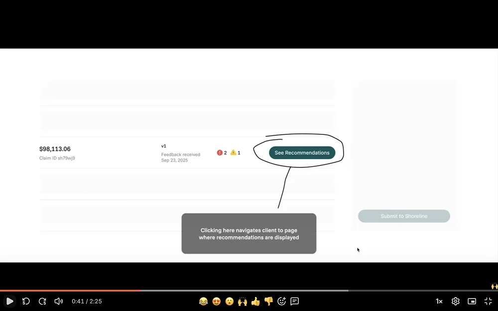
Encounter
The Encounter was the heart of Argus. Here the user engaged in the feedback loop that was the platform's primary offering. The visual framework for the Encounter screen remained consistent across both planned releases, but a few key layout elements needed a "now" and "later" treatment.
Similarly, table rows would need to evolve. A version 0.5 of the state model was created and materialized in the status displayed and actions available in each row, per file type. Row actions were dynamic, changing with the status to keep the next step obvious.
Given there would be a relatively small number of files in each Encounter, I took the opportunity to make each upload feel more weighty - like a living object rather than a line item. The lead column featured a fun piece of UI that previewed the file and communicated status, version, and single or multi-page nature.

Suggestion UI
Suggestions were the vessels for feedback provided by the AI service in MVP 1.0. Suggestion cards supported multiple props and were scoped to the version of the file(s) or encounter(s) it referenced. The component was crafted with the following in mind:
In Retool, all feedback was scoped at the encounter level. Expanding the possible relationships suggestions could have to their source(s) helped improve context, facilitating easier discovery and understanding.
- Encounter (E.g., missing file)
- Multi-encounter (E.g., lacking prior conservative care measures)
- File (E.g., missing signature)
- Multi-file (E.g., inconsistent measurements)
Issue type was mostly only needed behind the scenes but surfaced in the suggestion card as a low-cost context helper and parameter for filtering. The goal over time was for the user to internalize the categorization and anticipate the subsequent feedback. Internally, issue type would be very helpful for finding trends in submission flaws.
- Missing (Missing a document altogether or an element not documented)
- Mismatch (Conflict or inconsistency in documentation)
- Sequence (Trends and details from past encounters don’t add up)
- Billing (HCFA specific issues, use of mods, etc.)
- Evidence quality (Evidence is provided but unintelligible)
- Policy (Non-CMS: LCD, Shoreline business standards)
- Specificity (Not explicit enough for certain things)
- Authentication (Missing signature on clinical notes/addenda)
The concept of varying levels of severity was born to assist busy users with priotizing their effort. A quick scan should allow them to quickly identify essential tasks. I doscivered Argus's AI model wasn't able to actually calculate accurate claim denial or approval probability, so we simplified severity into two buckets for MVP 1.0 with a grander vision in mind for later iterations.
 Critical - These are auto fails. Typical examples include issue types of missing, billing, authentication
 Recommended - Encompassed everything else that wasn't critical. Typical examples include mismatch, sequence, evidence quality, specificity)
Suggestions have state and (within the file version they exist in) can either be 'To Do', 'Done' or 'Ignored'. This was in part to keep a clean list of tasks in front of the user and also allowed us to gate the re-upload process. Forced acknowledgement of the feedback before re-upload helped keep the user situated and helped Shoreline collect data around accuracy.
Metadata such as time created would be helpful for joint management of Encounters.
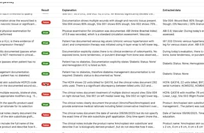
Inconsistent usage and waste
MismatchUsage and waste measurements appear inconsistent with documented wound size. The 45 sqcm usage with 8 sqcm waste suggests a 82% efficiency rate, which is reasonable, but your clinical notes don't justify this specific measurement. Correlate harvesting technique and donor site selection in your documentation.


Unclear wound photo
Evidence qualityThe wound photograph is unclear and doesn't adequately demonstrate the extent of tissue loss. Per LCD guidelines, pre- and post-operative images must clearly show anatomical landmarks. Retake with better lighting and scale reference.
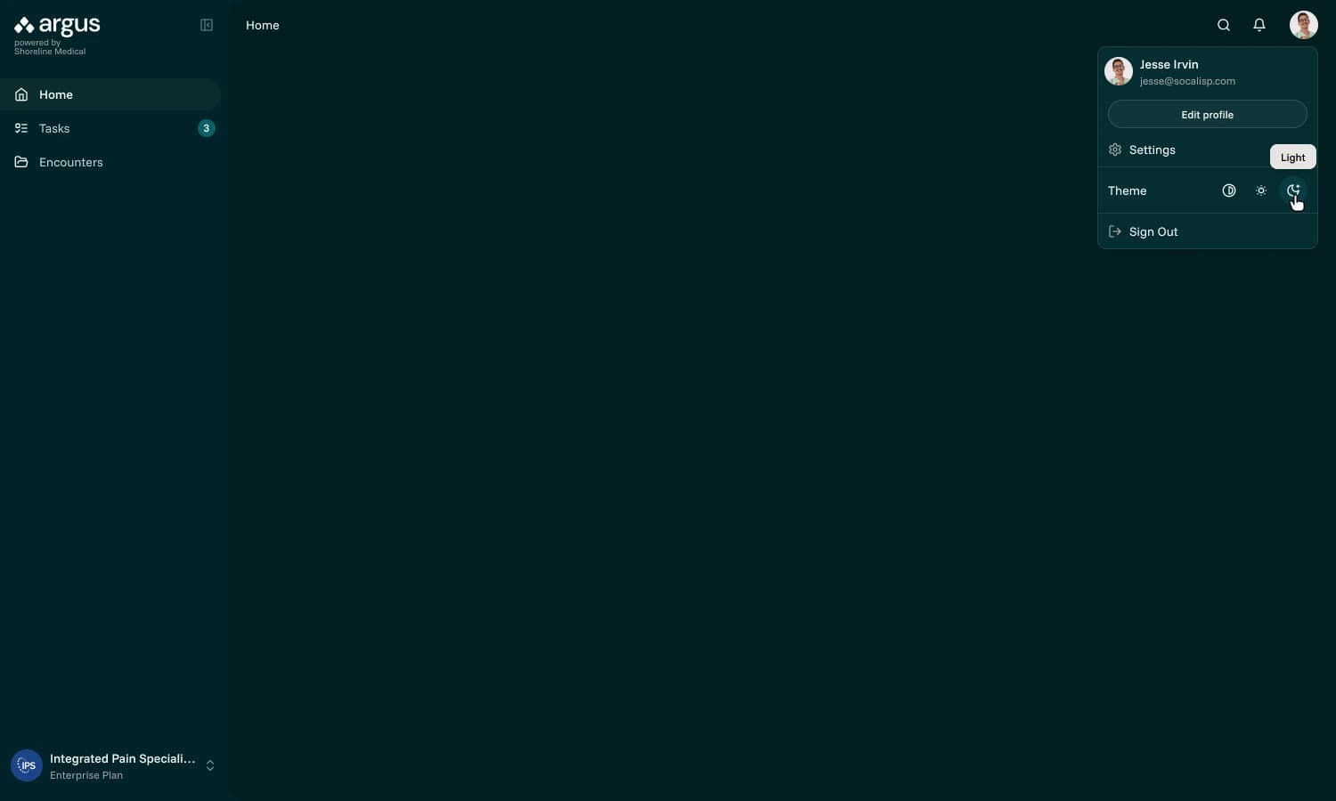
Dark mode
Adding a dark color mode was requested by leadership. Dark mode was not in the original scope but an easy value add, building on the Tailwind boilerplate theme we used to bootstrap the app.
File view
App navigation is tucked away and the sidebar appears on the left to signal a mode switch and focus attention on the task at hand. In MVP 1.0, the extracted source corresponding with the active suggestion is highlighted.
During discovery I learned many of the medical staff worked with EHR sysems that don't allow for rewriting clinical notes. For this reason, the option to append was needed alongside the ability to fully replace the errant file.
To stand out among mostly very sterile-looking systems in the healthcare industry, I wanted to add a brand personality to empty states, workflow milestones and common non-OK HTTP statuses.
I partnered with marketing to develop a collection of illustrations to suit Argus's needs, personally kicking off the team's illustrator.


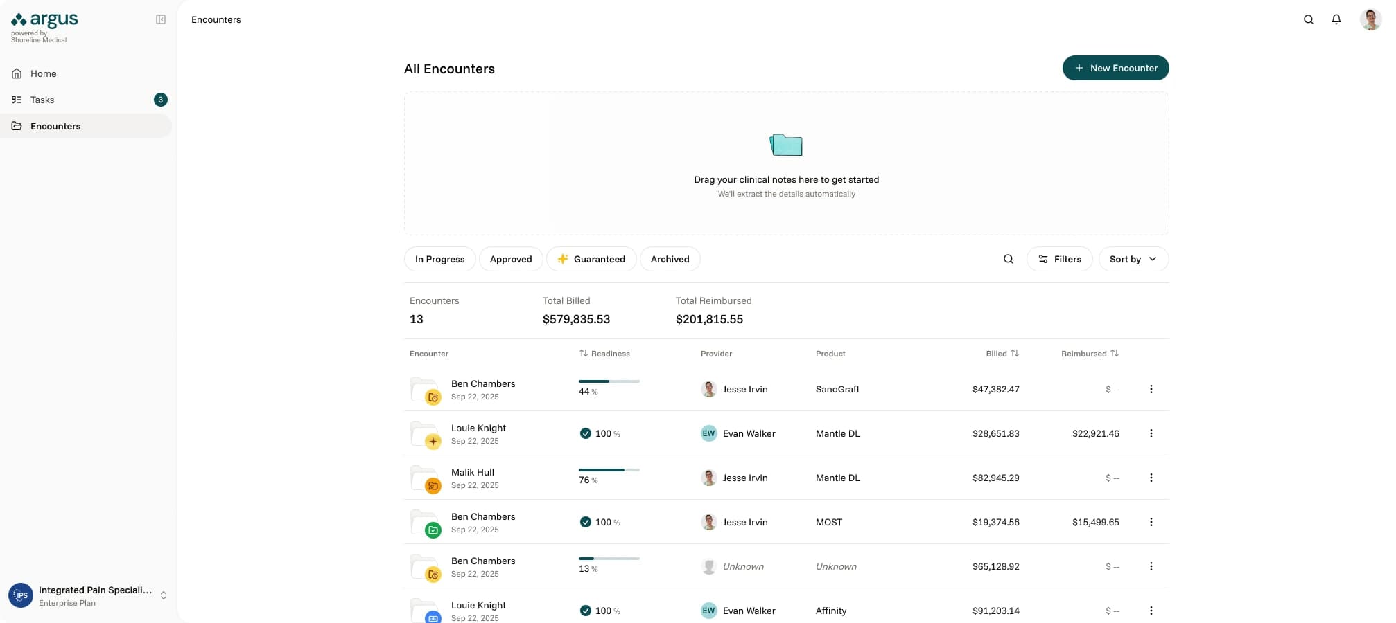
Encounter list screen
I refined the data table structure on the 'All Encounters' page to prioritize record identification over cross-row comparison, and introduced a new 'Readiness' column, aligning the UI with core user workflows. To enhance discoverability, I implemented filtering logic that featured persistent status chips.
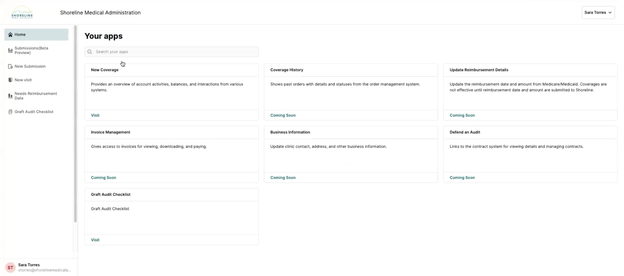
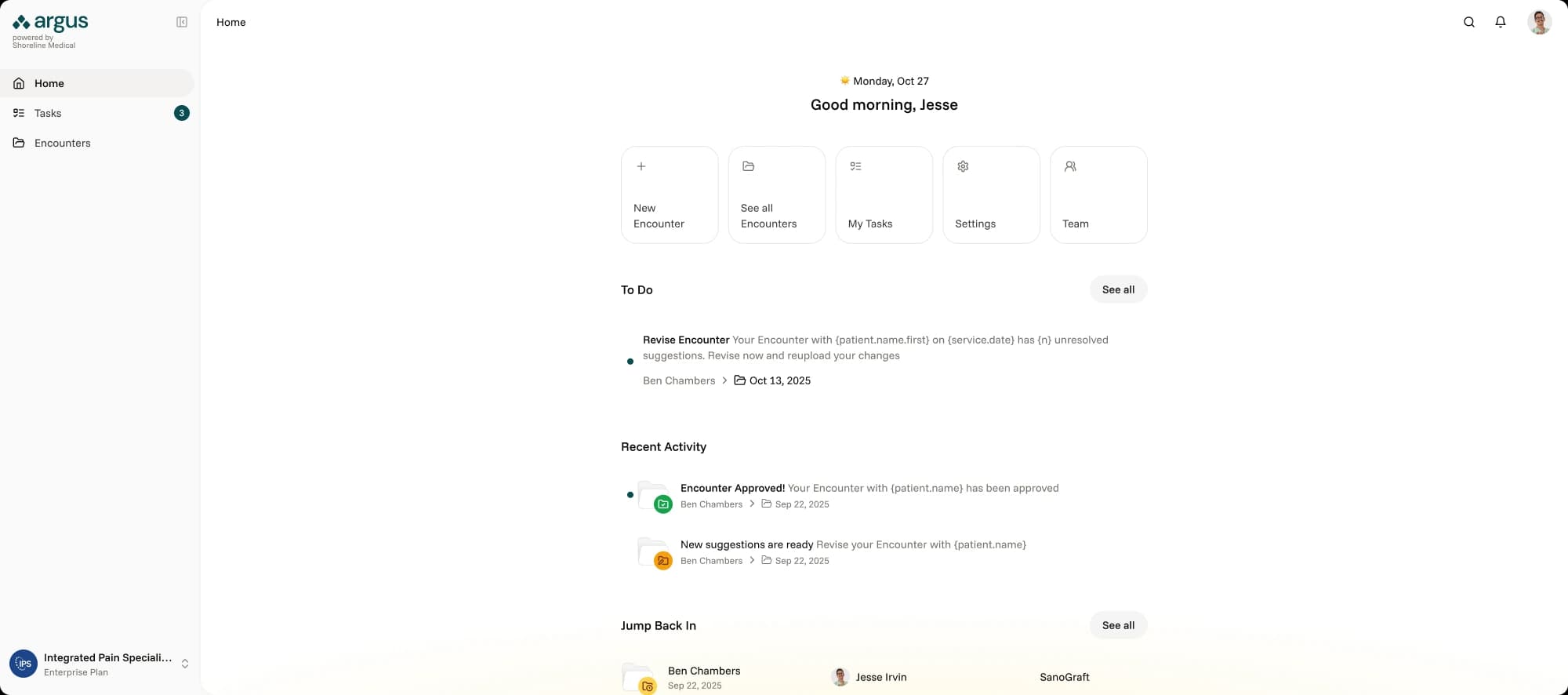
Home page
Until Shoreline was able to gather more insight into how clients used Argus, the Home page was intentionally designed to be minimal, serving primarily as a launchpad that emphasized visibility for pending revisions with the goal of getting users back into their workflow as smoothly as possible.
Reflection
Six weeks is not a lot of time to take a product from nothing to MVP, especially in a domain I had no prior experience in. The thing that made it work was getting alignment early and being honest about what we didn't know. The service blueprint ended up being the single most important artifact of the project, not because it was a beautiful deliverable, but because it forced every stakeholder to confront the same reality at the same time. That's where the real progress happened.
The mid-project pivot from full self-service to MVP 0.5 could have been derailing, but because we had abstracted user goals from features early on, the foundation held. It reinforced something I keep learning: the best design decisions aren't about getting everything right up front. They're about building in a way that makes it cheap to be wrong.
If I could go back, I'd push harder to get even a lightweight analytics baseline before the project started. We set benchmarks, but without real pre-launch data to compare against, measuring impact after the fact was harder than it needed to be.